Hanh Hoang
Jul 04 2022 •4 minutes
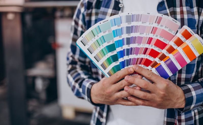
Color is one of the most important factors that lead to the purchase decision of each person. As a seller Print On Demand, the minimum thing that you need to know is how to combine colors when printing and colors displayed on electronic devices. If you are new to Print On Demand and looking for the key to solving color problems, this is the article for you!
To have the most beautiful printed products when promoting on e-commerce platforms as well as optimizing colors on printed products, sellers need to pay attention to some of the following factors.
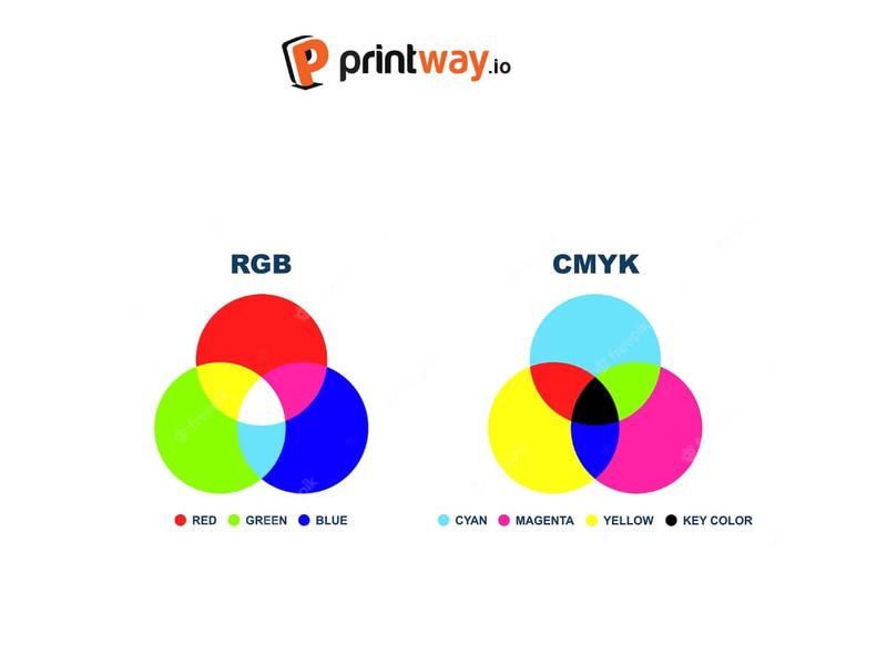
RGB and CMYK are two familiar color modes that any designer knows well, but for those who are new to Print On Demand, these terms can be quite unfamiliar.
RGB stands for three basic colors, including Red - Green - Blue. When changing the ratio of the 3 RGB colors, one can produce a multitude of different colors. The working principle of the RGB color system is light emission according to the complementary light model. RGB colors can only be used for design, and display on monitors, computers, phones, and electronic devices in general.
CMYK stands for:
This is a subtractive color system and is used exclusively for printing, on non-luminous objects. The principle of operation of the CMYK color system is to absorb light. In an easy way, the CMYK color system is only displayed on non-luminous objects and only reflects light from other sources. That is why when printing shirts, posters, or printing images on products such as Mug, Tumbler,... The seller needs to adjust the color system to CMYK.
As mentioned above, CMYK and RGB are used for different purposes. The RGB color system displays better on luminescent devices with white light. This means that it is suitable for use with designs on electronic devices, computers as well as colors in the web design industry.
While CMYK is the color system used in printing. To avoid color differences in print and design, you can adjust the color system at the beginning of the design to avoid color on the product and color on the design is not the same.
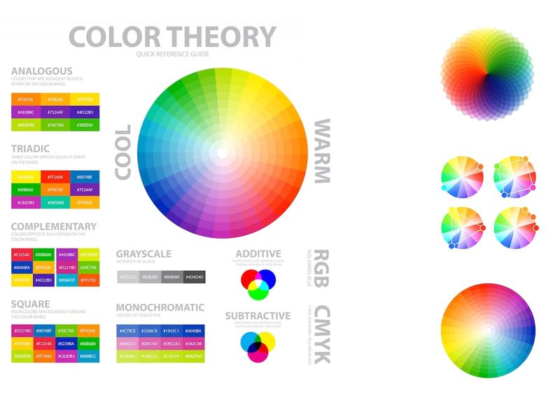
A design with harmonious colors will help the product catch the eye and attract more. If you do not know how to mix colors on the product, the seller can refer to 06 classic color schemes in the design immediately below!
de
The Monochromatic color scheme is the use of single colors and adjusts the tone and shape of the color. These colors are suitable for products in the niche of minimalism, minimalism, and modernity. This color scheme impresses because it focuses on details, and images printed on the product.
Similar colors are the colors that stand next to each other on the color wheel, the same color scheme design often brings a soft, pleasant, comfortable feeling. With this color scheme, sellers can choose a dominant color tone, then choose colors that interact well with this main color to form a harmonious overall. Similar color schemes can be used on Apparel, Hats, or shoes.
A contrasting color scheme is the use of opposite colors on the pure color ring. The use of opposite tones makes the design more prominent. Especially on products that already own dark tones such as Black Ceramic Mug, Black T-shirts,...
The triple color scheme is the safest color scheme in printing product design. These are three colors located at three corners of the pure color ring and create an even triangle. Thanks to this symmetry, the triple color scheme design will create balance, easy to see, but due to the safe color scheme, the design with this color scheme often creates a sense of monotony and lack of breakthrough.
Design with complementary color schemes alternately brings a new, different feeling, breaking the usual clichés. This unique color scheme often creates an impression that is difficult to ignore on POD products. However, sellers also need to pay attention because the mixed tones may not be suitable for too many people.
Complementary color scheme set 4 is the most complex of the 6 color schemes suggested in this article. The reason lies in choosing the right color. If you can choose the right color tones, POD products will create a new, modern feeling, by the current color design trend.
The above is some basic information about colors in printing and design and some suggestions on color schemes for sellers Print On Demand can refer to. Hope this information is useful to sellers in the design process in the future!